Last week I got an email from an artist I’d purchased work from a couple of years back. She’d remembered I lived in Atlanta and her gallery was going to have a booth at the first annual Atlanta Art Fair this weekend at Pullman Yards. We’ll ignore the fact that a huge art event was happening in my relative hood and it took someone from LA to inform me. Thursday night was opening night so a perfect end of the week let’s go see some art and maybe purchase something! (Spoiler: None was purchased but bookmarks were place for some works at a future date.)
Traffic was crazy once we got in the Kirkwood area but I couldn’t believe it was all for the art fair. It was. Inside–after a long walk from our parking spot across the gravelly lot in Lisa’s high heels (her in her heels, not me)–was packed with art gawkers like us. Many much more chic than us (the contrast being from none to something) but also a range of what Atlanta is, which was cool. The aforementioned gallery owner had a booth just inside so we chatted up as I eyeballed some nice works that she brought from LA. I later took photos of several works throughout the fair as references for interest and possible purchase, but it felt weird doing that while we were talking so the artist whose work I was interested in is currently a mystery until I email.
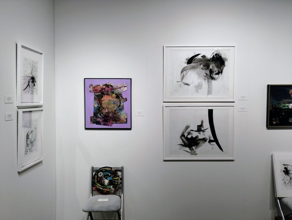
The two calligraphy-inspired drawing above (ink and graphite) are by Iranian-American Nazanin Moghbeli, represented by the Susanna Gold gallery in Pennsylvania. (Apologies for the lack of detail in these pics and others. I was lucky to get two seconds without people crowding me out.) They were the most in-budget pieces that tempted me. They seemed to live in a half-world presence between writing and abstraction.
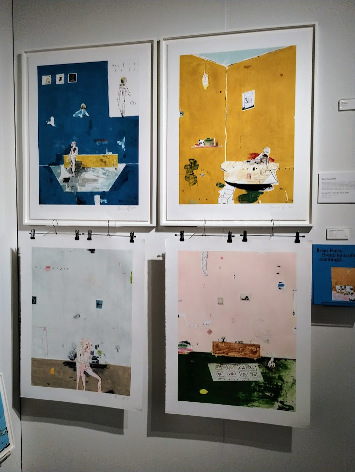
More work on paper from by far the best gallery at the fair, Stoney Road Press from Dublin (One of several non-US galleries represented). These prints are by Brian Harte and are created using carborundum intaglio. My printmaking class was long enough ago that I only have a vague recollection of the different techniques. With this technique, the artist covers the printing surface with carborundum and scrapes away while the carborundum is wet and/or dry depending on the effect needed. The areas where it remains will be the printed part. I should have taken the time to ask the representative how the artist made these fragmented, half-realized worlds. Clearer photos are on their site.
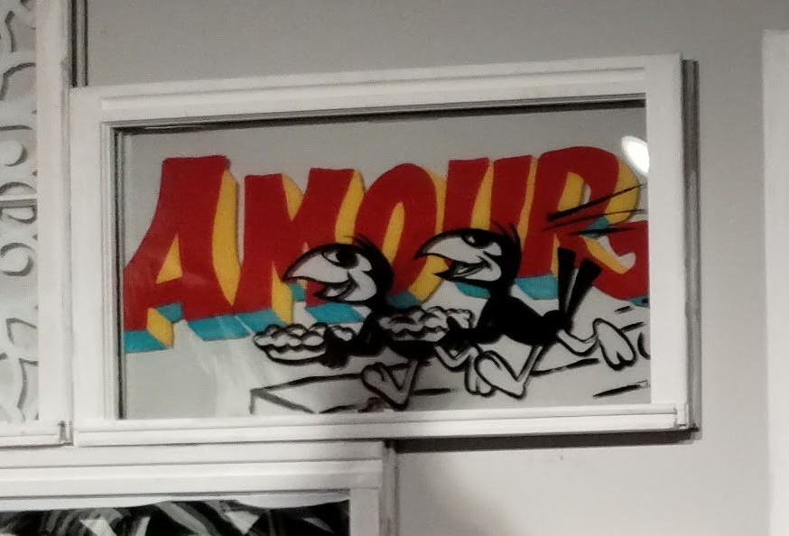
Still trying to source the artists from some of the other photos (updates as I work it out):
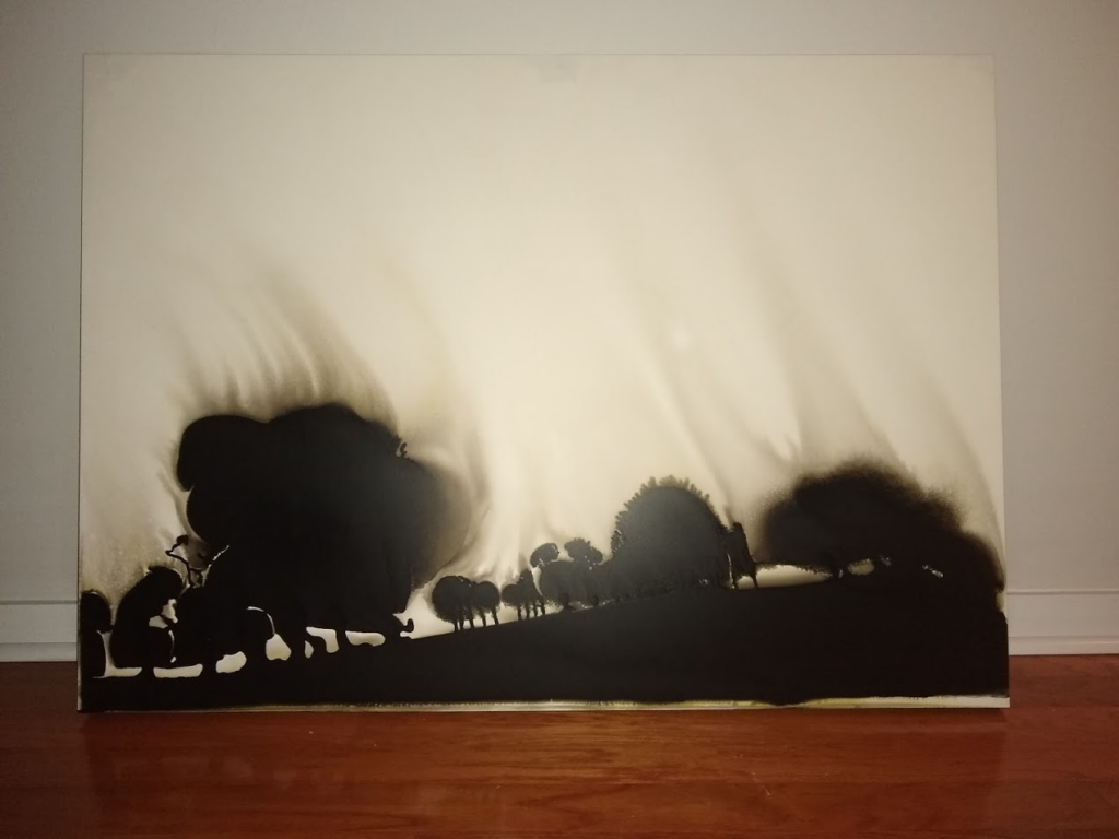
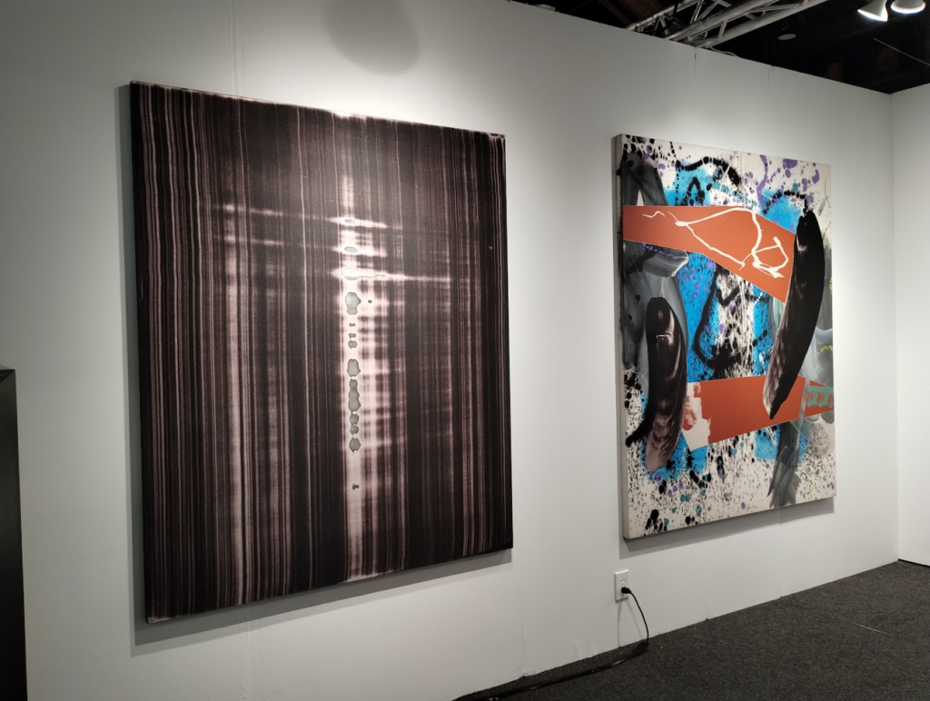
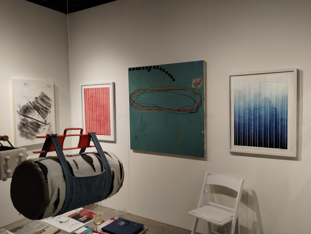
These were some larger works that I’d love to have but have no space for. The black and white, photographic smear on the left was printed on cloth.
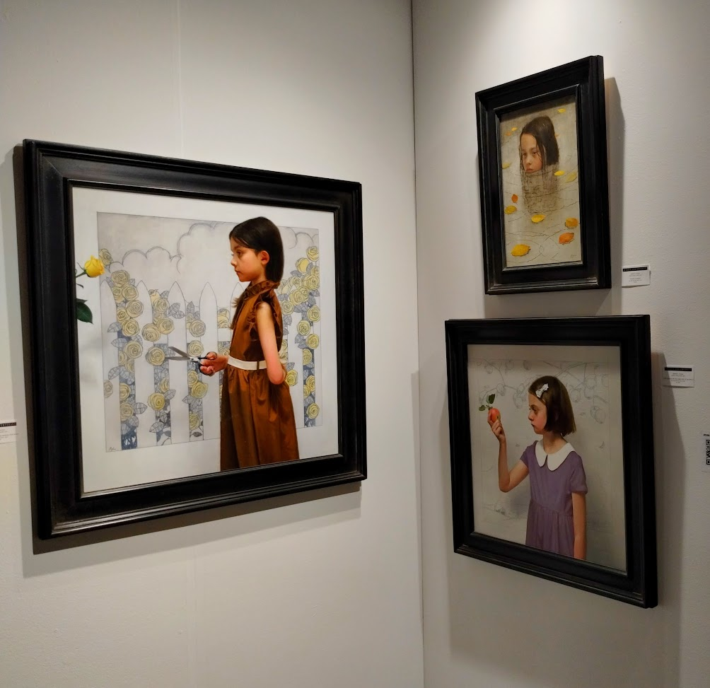
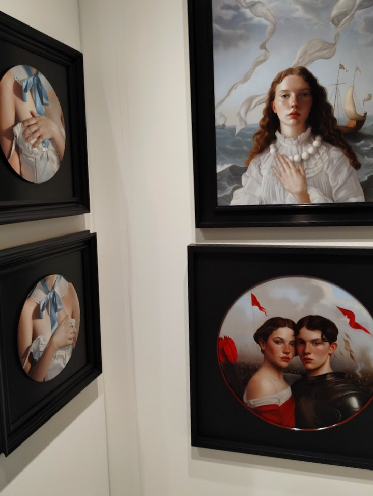
Mary Jane Ansell from Arcadia Contemporary in NYC is one of the many outstanding artist they had. To the left are some wry, light observations and to the right classically-inspired portraits (of a sort). I’ll say again: I’m happy there were no restriction on photos but I think the only reason was the tight space for many of the gallery and just the volume of people.
I leaned towards abstraction throughout the fair, and the painting in the center caught me, despite or because of that ick green. Ever since, or manifested from, the Chris Strawbridge work I purchased years ago, the mix of paint and drawing and sgraffito seemed like such a rich medium.
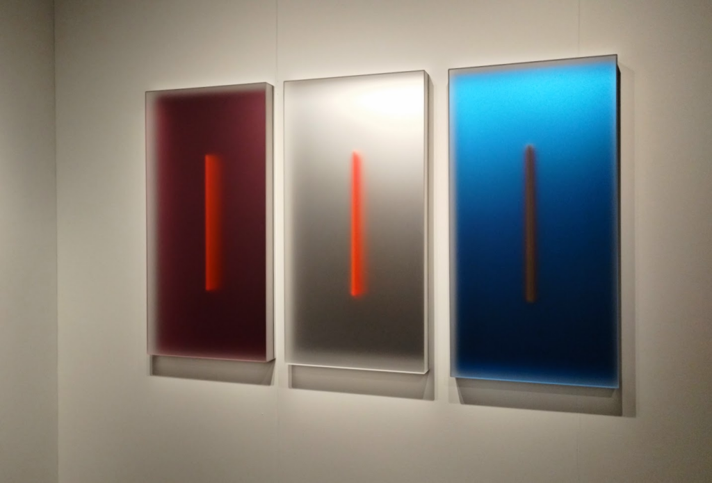
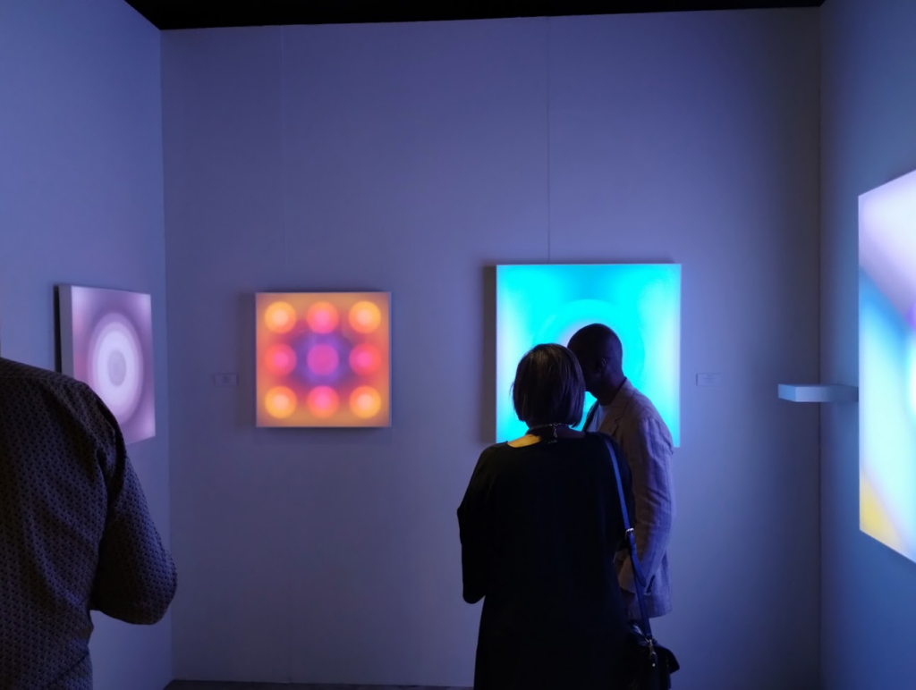
Lisa asked whether I’d ever thought of purchasing light art. These made me want to, especially the triptych on the left.
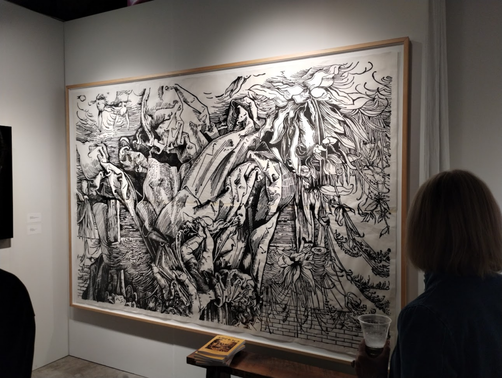
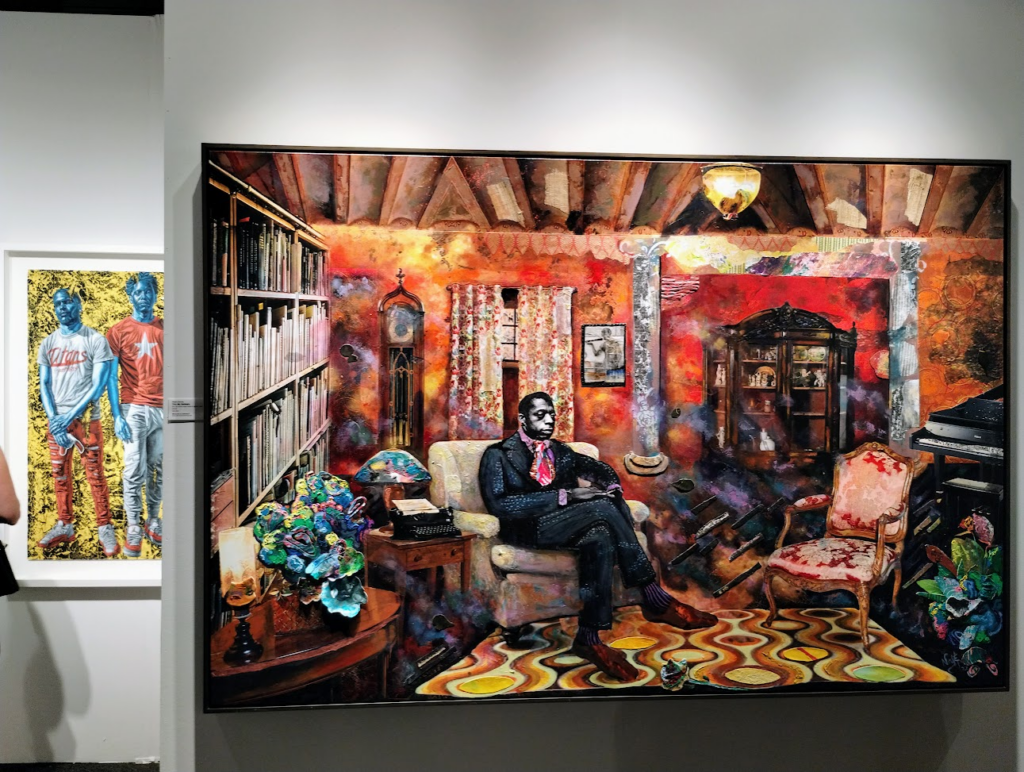
An epic work depicting James Baldwin. I want to hang out with the person who purchases this.
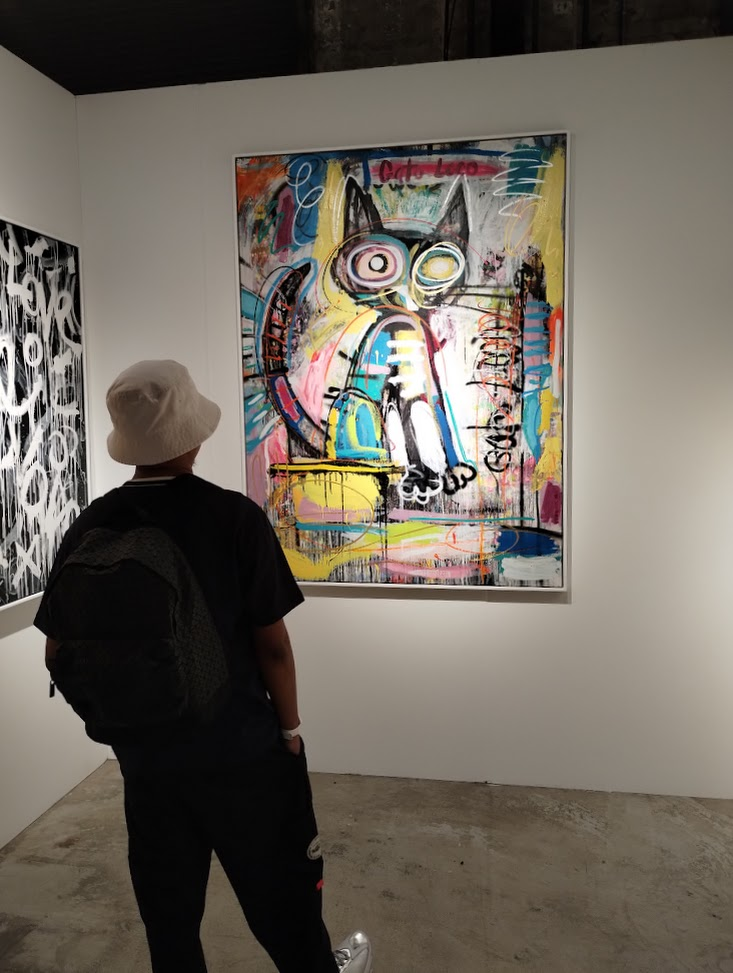
And a lot of work that was just simply fun. The left is part of a larger assemblage of framed cultural ephemera; center is Gato Loco; right is a couple of pieces that place Simpsons characters, illustrated with bright gems, in realistic scenes. This is the first annual fair and that better be a promise.